I’ve sat at grading sessions and watched with great interest as colourists worked on films that I’d edited. The process fascinated me. I realised how colour could be used more effectively to tell stories. And that led me to explore colour grading tools as part of my editing process.
As film editors, we use pacing, tempo sound effects and music to bring stories to life in post. And grading can be one more layer – a power tool in the storytelling process. But in most cases, this opportunity is lost and grading is merely a means to beautify the visual.
The power of colour in communication is universal across the living world. Animals use it all the time to attract mates, hide from enemies or differentiate edible from in-edible foods. Psychology has had a long dance with colour theory since Isaac Newton first passed white light through a prism breaking it into its constituent colours, and Carl Jung used colour to treat his patients.
Reds, yellows and oranges are known as warm colours. They elicit emotions of warmth, comfort, love, anger, or hostility. You could see red when your arch-nemesis walks around the corner or you may blush when in the presence of your first love. On the other hand, blues can literally “give us the blues” causing feelings of sadness. They are known as cool colours and can induce calm, and tranquillity (think: the light of dawn).
So why not use colour as part of our arsenal of storytelling tools? That’s where colour grading comes in. All big-budget features are graded at post houses these days. But grading can be particularly important in documentary films where a filmmaker may not have a lot of control during production. And yet, not many filmmakers pay enough attention to this aspect of the storytelling process.
When they do, colour grading is unfortunately looked at as a way to beautify clips in post or to correct issues with exposure or colour balancing. But that’s missing half the story. Colour grading is more than enhancing visuals. It can be an integral tool in storytelling.
Here’s how I used colours during the post-production of Confluence, a documentary film by filmmaker Sonali Devnani.
Confluence is set in the city of Varanasi in central India. Diving under the surface, the film takes the viewer through the visual abundance of the city and peeks into the life and struggle of the people there. The film explores three aspects of life in this holy city – the rituals of religious tradition, the struggles of the families from the boatmen caste and prostitution that’s prevalent across the underbelly of the city.
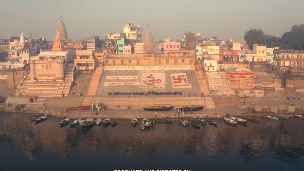
The film had three distinct levels that were inter-woven right through the film. Each level had to have a set of emotions associated with it. To help in this, we used music as aural cues. But then we also used colour as a visual aid to help tell the story.
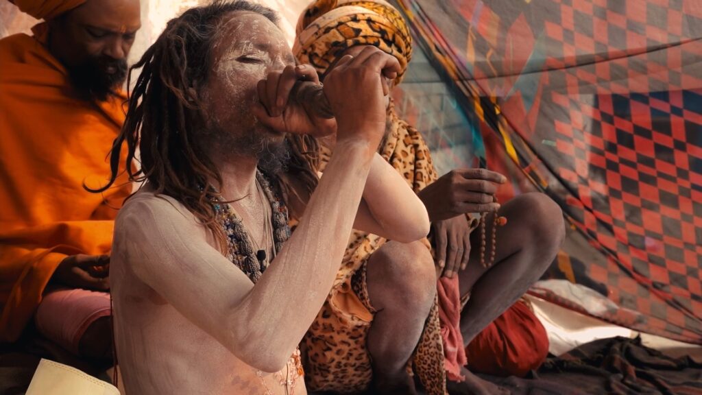
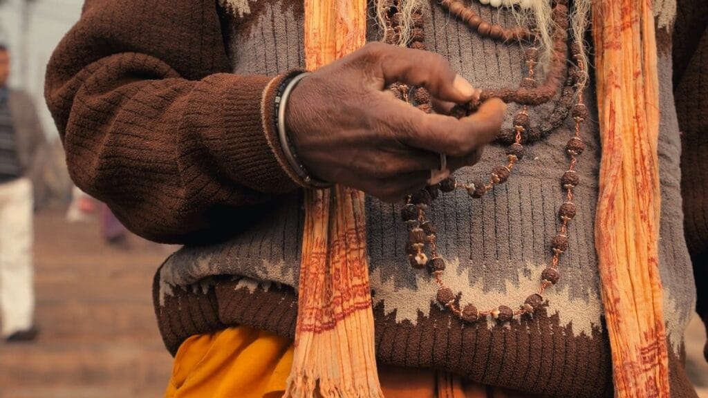
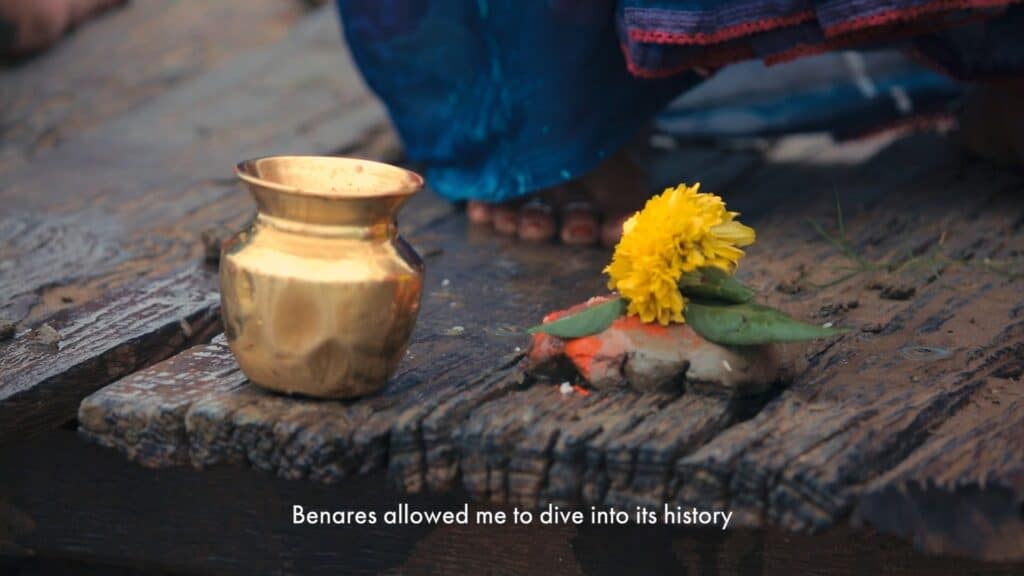
For the religious section, we went with vibrant colours to reflect the common perception of Varanasi – a vibrant city that is the cultural heart of India. Most of the shots used were in bright daylight with the warm sun thus creating the feeling of “all’s right with the world”. The grade enhanced this with saturated yellows and soft glow.
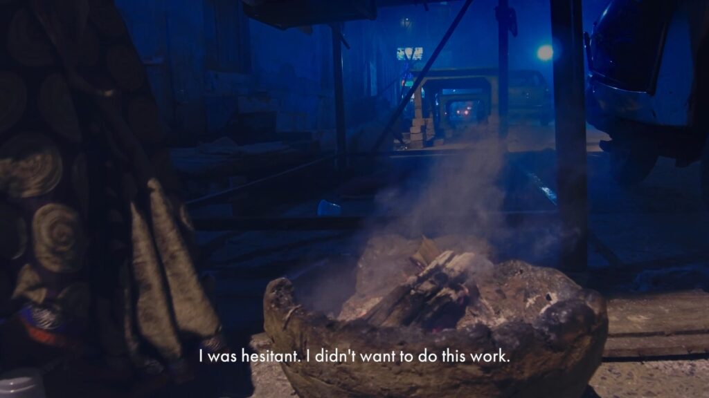
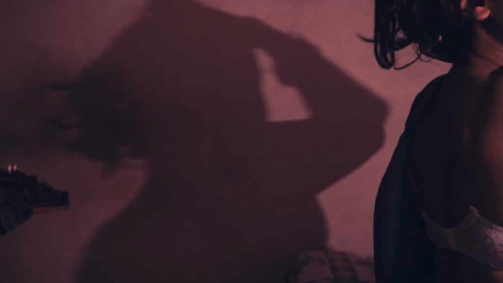
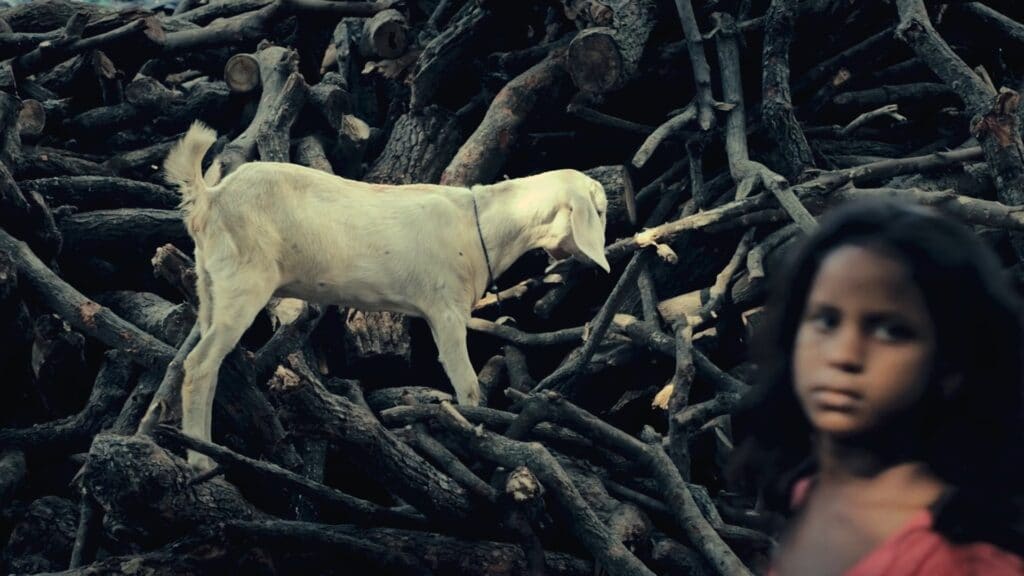
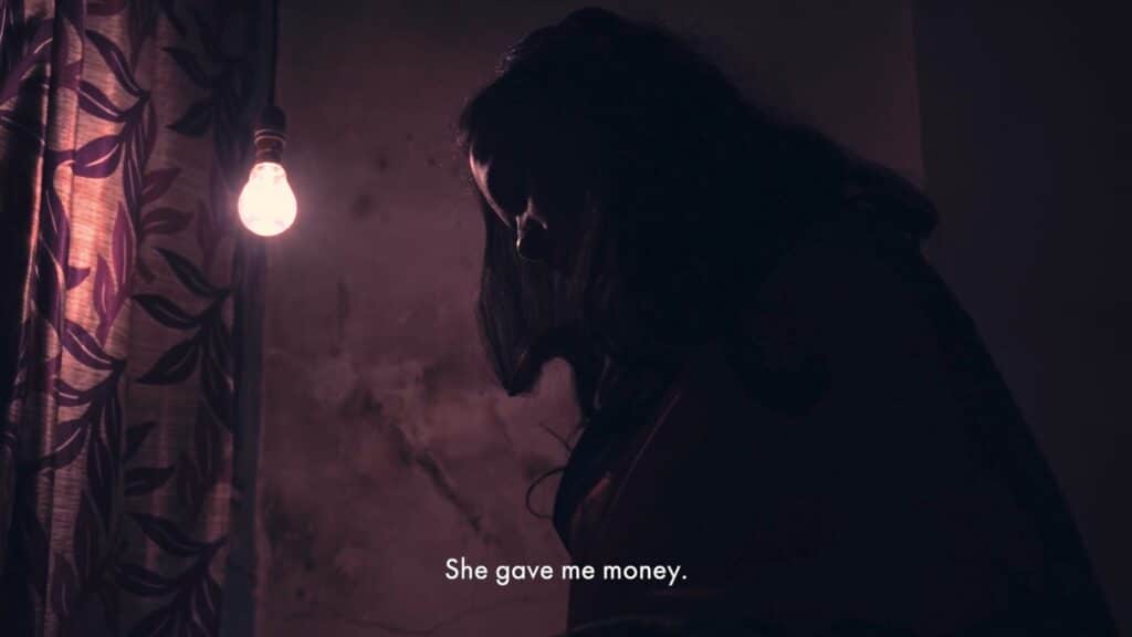
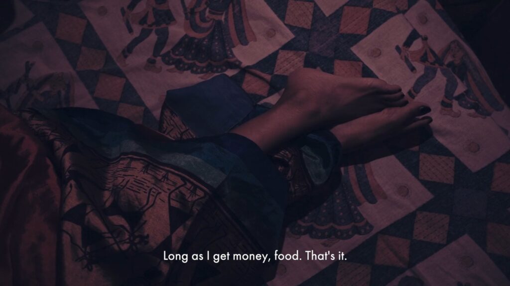
On the other end, when talking of the stories of women in sex work, we underexposed shots and relied heavily on the primaries – blues and reds, with intense grain. This was exaggerated in the climax interior scene beautifully shot by our DP Gaurav Bhalero.
The boatmen of Varanasi bridge these two worlds. They are a part of the religious but are not truly in it. They lie on the fringes, eking out an existence. In many ways they are similar to the lot of the sex workers, but yet apart. To portray this dichotomy, we used a neutral grade with hints of blues.
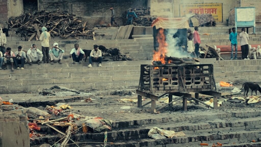
I believe colour is not used in indie documentary films as much as it should. Too often, footage is shot in standard Rec.709 and if the film is graded, it’s purely for a “cinematic” look. But with modern digital cameras (even the cheaper ones) capable of shooting in LOG or RAW and with post-production tools like Davinci Resolve, documentary filmmakers have a powerful tool in their bag to further their stories. Budgets for grading documentary films too are not as high as in drama. With a bit of planning any documentary film today could benefit from a session of colour grading.
We can truly say, the future of filmmaking is colourful!
